Spoonflower Challenge Results & A Design Controversy
I’m back with the results of my first Spoonflower design challenge—and a little unexpected drama surrounding my second entry.
The Results: Under the Sakura Sky
When I submitted Under the Sakura Sky, my goal was simply to take the leap and put my work out there. Winning wasn’t my expectation, but I did hope for a decent placement. I finished in 1061st place, which, admittedly, was a bit disappointing—I thought I might rank higher. However, reviewing the top 100 entries gave me valuable insight into areas where I can improve.
One key takeaway? Many successful designs are highly polished, and many artists in the top rankings have extensive portfolios. The first-place winner’s design was also handcrafted but used a linocut print style, which seems to resonate well with voters. My work, painted in a loose, abstract style, may not have been as widely relatable. Additionally, with fewer than 20 designs in my shop compared to the winner’s 5,400+ designs, it’s clear that consistency and volume play a role in success. Moving forward, I plan to explore new artistic techniques, like block printing, to expand my creative range.
The Second Challenge: A Surprise Setback
The next Spoonflower challenge, Minimalist Cheater Quilts, almost didn’t happen for me—for a few reasons. The prompt required using only two colors to create a minimalist quilt-inspired pattern with geometric shapes and classic quilt block motifs. At first, I hesitated. I’m not a quilter, though I deeply respect the craft, and I wasn’t sure how to approach the design.
Then, inspiration struck just five days before the deadline. While working on my Trinity Bloom collection, I realized that sacred geometry could be a perfect fit for this challenge.
Rather than following the prompt’s black-and-white example, I wanted to use color. After some research, I found that two of the most popular quilt colors for 2025 were Pantone’s Color of the Year, Mocha Mousse, and Kona’s Color of the Year, Nocturne. Initially, I wasn’t convinced these shades would work together, but as I mixed my paints, the combination reminded me of peanut butter and grape jelly—unexpected yet beautiful!
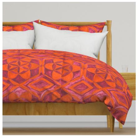
For my design, I used the Seed of Life geometric motif and created two versions:
- Threads of Life – Nocturne: Nocturne as the main color with Mocha Mousse as the accent.
- Threads of Life – Mocha Mousse: Mocha Mousse as the primary color with Nocturne as the accent.
I submitted Threads of Life – Mocha Mousse to the challenge and made both versions available in my Spoonflower shop.
The Unexpected Email
The next day, I received an email from Spoonflower stating that my entry had been removed because it contained more than two colors. I was shocked—especially since I had been extra careful to use only the two required shades. In fact, I had mixed more paint than needed to ensure I wouldn’t run out and accidentally create slight color variations.
Fortunately, Spoonflower allowed me to resubmit a different version, so I entered Threads of Life – Nocturne, which was accepted. Voting is currently open until February 11th, and I’m eager to see how it performs.
Looking Ahead
My goal moving forward is to break into the top 100 in future challenges. This means refining my pattern-making skills and pushing my creativity even further. Thank you for following along on my journey—I hope you’ll continue to watch my growth and share your thoughts. Let me know what you think in the comments!
Threads of Life Decor


